Wednesday, 28 April 2010

EVALUATION

Audience Responses

In order to determine whether my magazine was successful, and that it had matched all the criteria in the brief, I showed my target audience a copy of my magazine and asked what they thought.
Here is what they had to say:

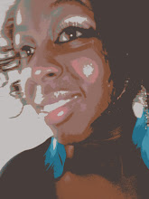
'The colours are eye catching and the models really define the magazine.'

'The language used relates to the readers and it is effective at persuading you to read on.'

'I would buy it if I saw it in a shop!'

'The photographs look professionally taken'

'It looks ready to be sold in shops!'

Feature Page

Contents Page

New Front Cover

Re-Designing the front cover

As i have chosen another cover model (model 3), I am deliberately using a Yellow colour scheme because it is eye catching. This will run through the text and will be applied to image effects and text boxes to show continuity.

Style and Colour Schemes -- UPDATE

The colour scheme will now consist of:
Light Orange (Gold Yellow), Black and White

The font for the title will be in 'Bauhaus 93'
Other fonts used on the magazine will be 'Impact' and 'Stencil Std'

These colours and styles will also run through my Contents and Feature Page.